Pivot grids
Pivot grids are an output option for the results of Employee charge statistics reports.
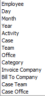
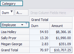
As explained, the results of this report contain a filtered selection of costs data, organised first by the employee who added the cost and then subtotalled by a second value, which can be one of the following options:
For example, if Category was selected above, then the results data displayed in an ordinary grid would be organised per employee (A), then subtotalled by category (B):
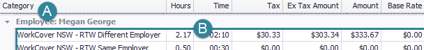
In this grid the organisation per employee is a result of the Group by box functionality (see Group list), a flexible way to organise grid data that also provides subtotals for the report.
Pivot grids example
Pivot grids offer a different method to organise the data. In a pivot grid column headings (fields) can be dragged into different row and column positions in order to sort and total the report data. Here's an example:
Explanantion
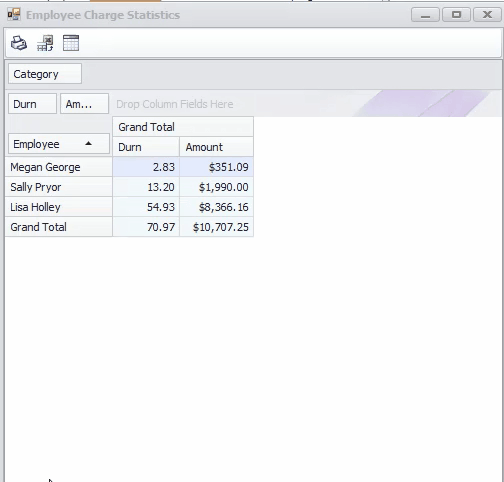
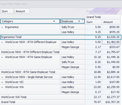
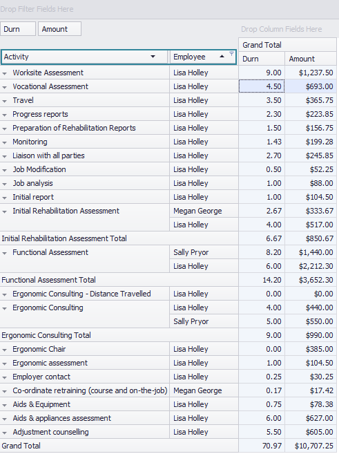
The results data in this pivot grid is organised by employee and then case category. The grid starts off simply:
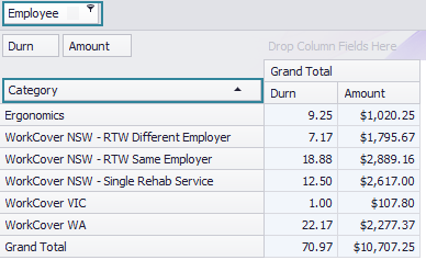
The data is summarised per employee and the category reference is at the top of the grid.
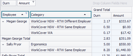
If we drag Category down to the left of Employee, the data is instantly summarised first by category then by employee:
Conversely, if we drag Category to the right of Employee, then the data is summarised by employee then by category.
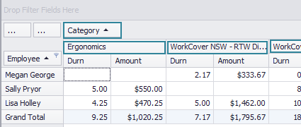
Alternatively, if we drag Category to the middle of the grid, then category data becomes part of the report data:
And if we drag Employee to the top of the grid, the data is now summarised only by category:
Thus, pivot grids offer considerable flexibility for you to organise the results data. And once organised the grid can be filtered, sorted and printed.
It can also be exported to an Excel file, where further data organisation and visualisation is possible.
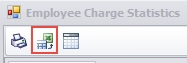
How to use pivot grids
As you may have realised from the examples above, a pivot grid is divided into 4 regions. In the example below, the results have been subtotalled by Case:
- Filter field(s)
- Column fields
- Row fields
- Data area
Fields here are not visible in the grid but can be used to filter the display.
The fields here provide the column headings.
The fields here provide the rows, with the first one providing the primary level of organisation.
The report data goes here.
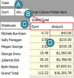
In the fragment below, Case has been dragged from A into C, i.e. from Filter field area to the Row fields area, and positioned to the left of the Employee field.
As a result the data is ordered and totalled by case and then by employee.
Note that:
- data can be sorted based on the value of any row fields (C) in the usual way. Simply click the triangle icon.
- each such field can also provide a filter if you click its filter icon
 .
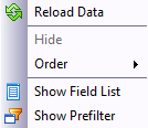
. - right-clicking a column header brings up some extra options: the Field List that can be used to move fields between the locations above; and a Prefilter that can filter the display based on the value of each cost's employee or (in this example) case.
Applications
A useful report option is to subtotal by Activity then by employee:
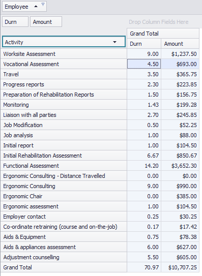
The division by employee can be removed, as explained above, with this result:
Visualisation using Excel
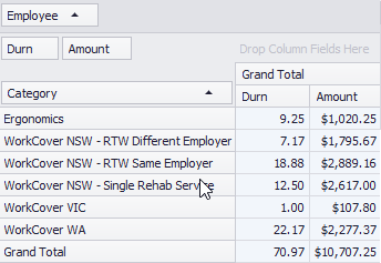
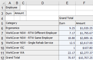
In this example, we start with a report that subtotals by category and we remove the division by employee, as described above:
If this report is exported as an Excel file, the result is:
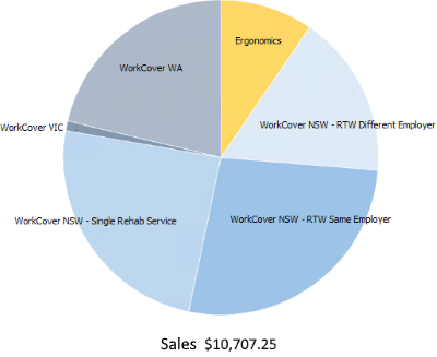
Finally, the Excel pie chart tool could be used to create this visualisation of the data:
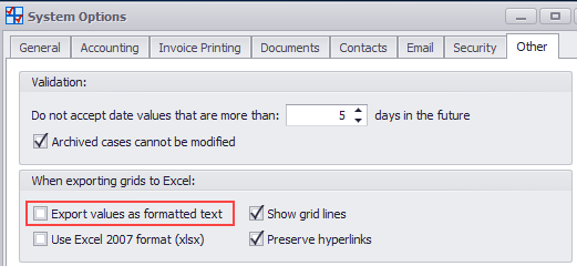
Note
Note that the system option Export values as formatted text should not be ticked if you want the report data to be exported as numeric values. This is set at the system options by selecting Tools > Options from the main menu, then clicking the Other tab.