Case Manager for Web 6.0
From version 6.0 onwards the web version of Case Manager has a brand new look and feel.
The former web version of Case Manager imitated most of the features of the Windows version, but we felt there were some areas that could be improved.
Now we've fixed that ... elegantly.
And at the same time we've looked with fresh eyes at the way you use Case Manager. We've streamlined and reorganised some of the tools so that they give you a more intuitive, user-friendly experience.
If you're an experienced user of the web version, you will notice some changes that we hope will deliver an improved experience. You'll be able to use our documentation to familiarise yourself quickly. We've also created a special video to introduce you.
Our aim is to future-proof the new web version, and to develop it so it becomes the platform of choice for all our customers.
Overview
The new web version is faster, cleaner and more intuitive, with a number of new features.
Improved running times |
Optimised processes means pages feel snappier and that means less waiting time for you. |
Responsive design |
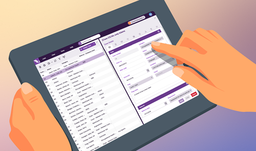
The screens are beautifully responsive and work really well on everything from iPads/tablets to laptops and desktop computers. |
Cleaner and more intuitive |
Screens have a modern look and feel, so they're easier for you to scan and find what you're looking for. The tools are more intuitive, to support and enhance your work with Case Manager. |
More features |
We're closing the gap between the web and Windows versions of Case Manager. For example, you can now monitor license usage and search permissions. And in both versions you can now preview images totally within Case Manager. |
Quickstart video |
For experienced users of the previous web version, the quickstart video below will help you transition easily: Users who are more familiar with the Windows version would also find Using the web version helpful. |
|
Best browsers to use |
The new web version has been optimised for Chrome and Firefox, see Which browsers work best below. |
Case Manager for Web 6.0
The features and enhancements include:
|
Filtering |
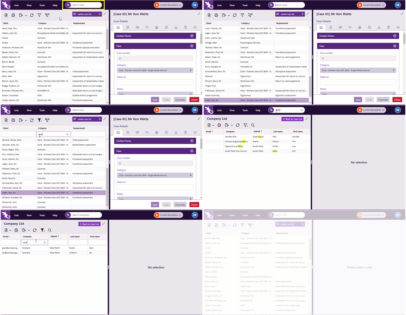
Locating items in lists is much faster and more efficient. The new search tool filters the list and highlights information containing the search text. Column filtering has also been improved. These features don't just apply to the Case List. They apply to all lists, such as the Company List, the Document Templates List, etc. Click image to see these features in action. Click again to close. |
|
Case List view management |
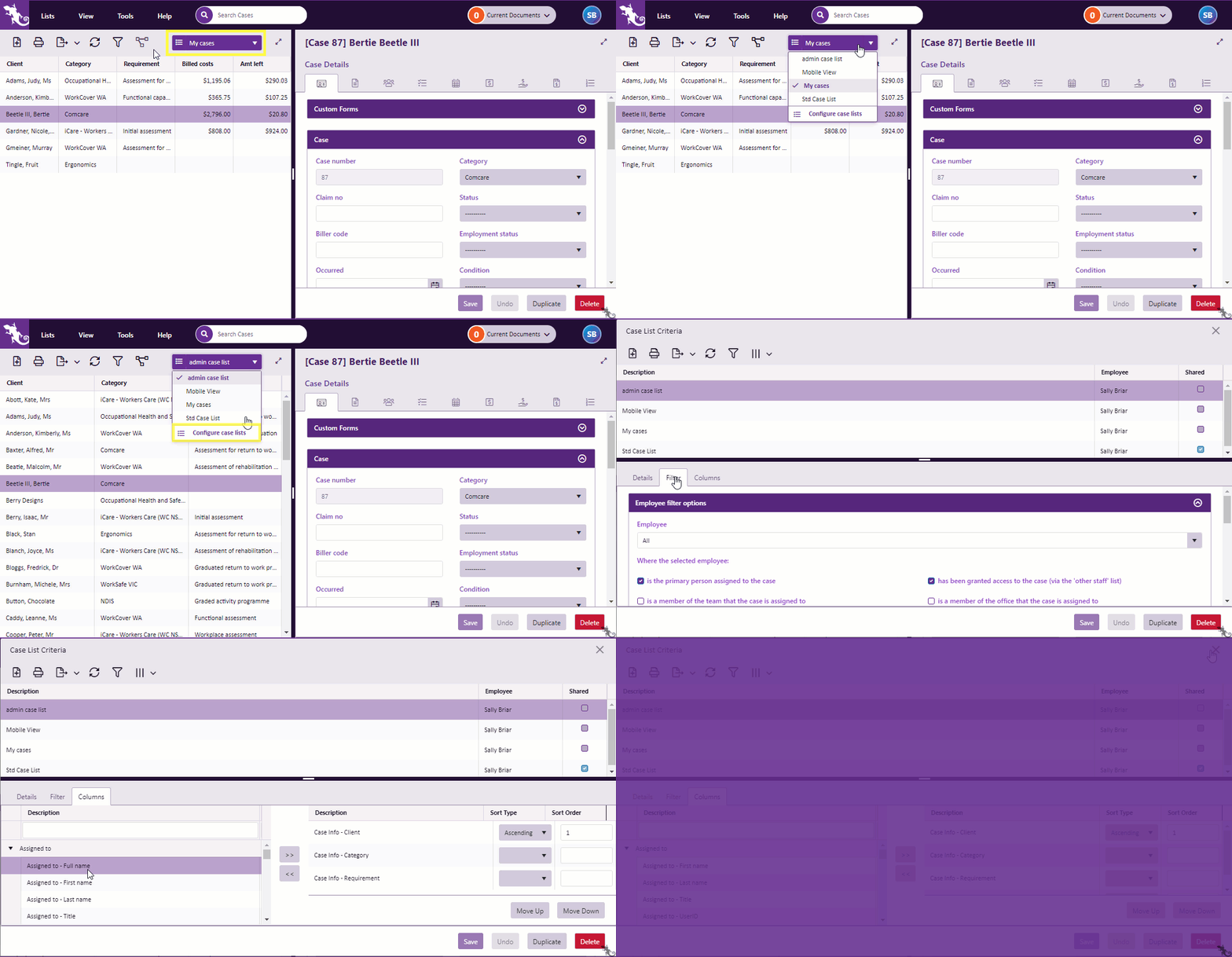
Switching Case List views has always been quicker in the web version. That's still true. We've also made it easier to modify the Case List Criteria. Click image to see this feature in action. Click again to close. |
|
Document locking |
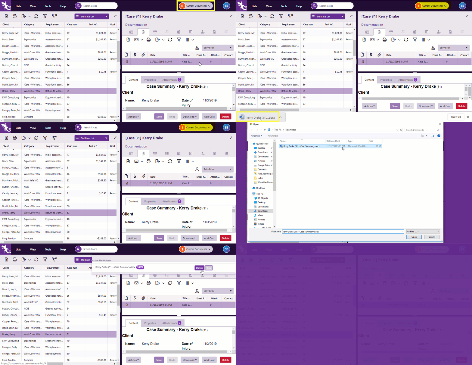
Management of documents such as Word files — locking, downloading and uploading — has been made clearer. Your locked documents are now displayed prominently, with ready access to controls for uploading and monitoring. Click image to see this feature in action. Click again to close. Note that:
|
|
Personal settings |
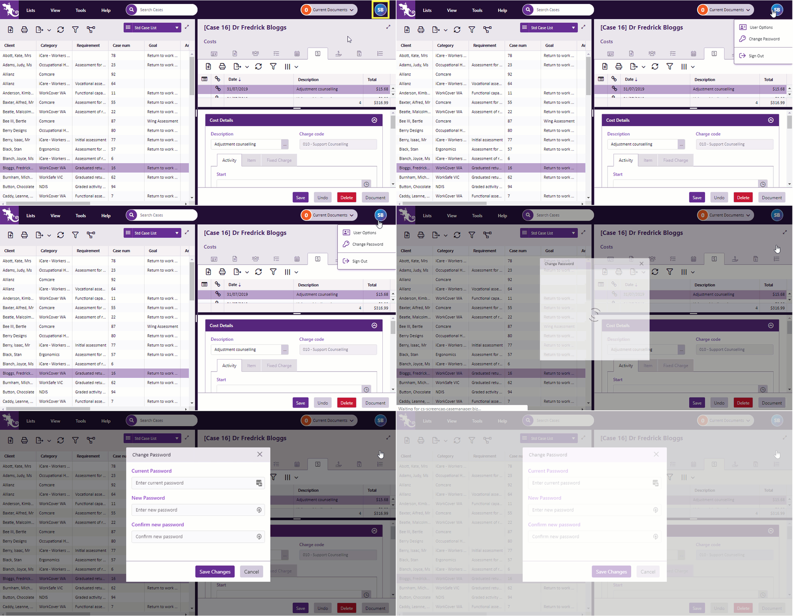
Personal settings have been collected together. An icon at the top right hand side of the screen provides convenient access to user options, password changes and logging out. Click image to see this feature in action. Click again to close. |
|
Preview images |
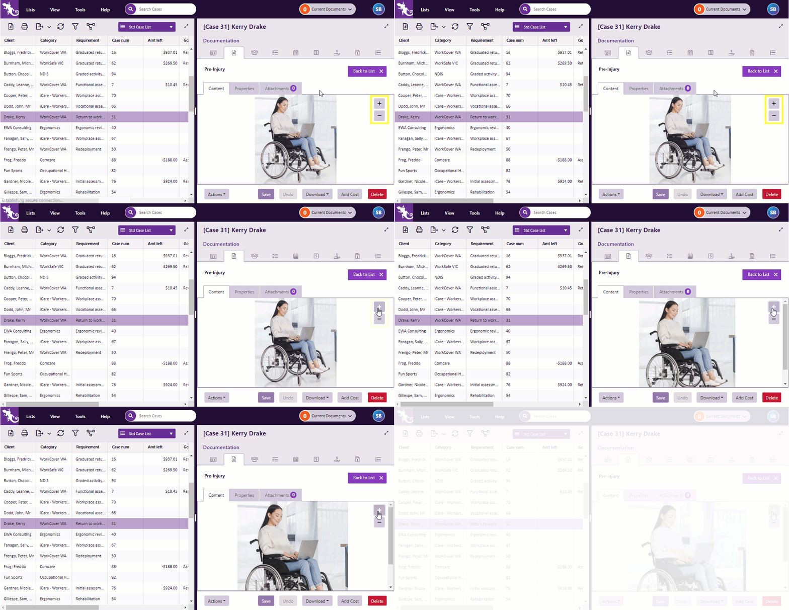
You can now preview images within Case Manager, zooming in and out as required. Click image to see this feature in action. Click again to close. |
Admin functions
| License management |
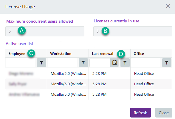
Admins can monitor license usage more easily by selecting Help > View License Usage from the main menu .
The License Usage window shows:
See Case Manager licenses FAQ for further details. |
|
Managing lists |
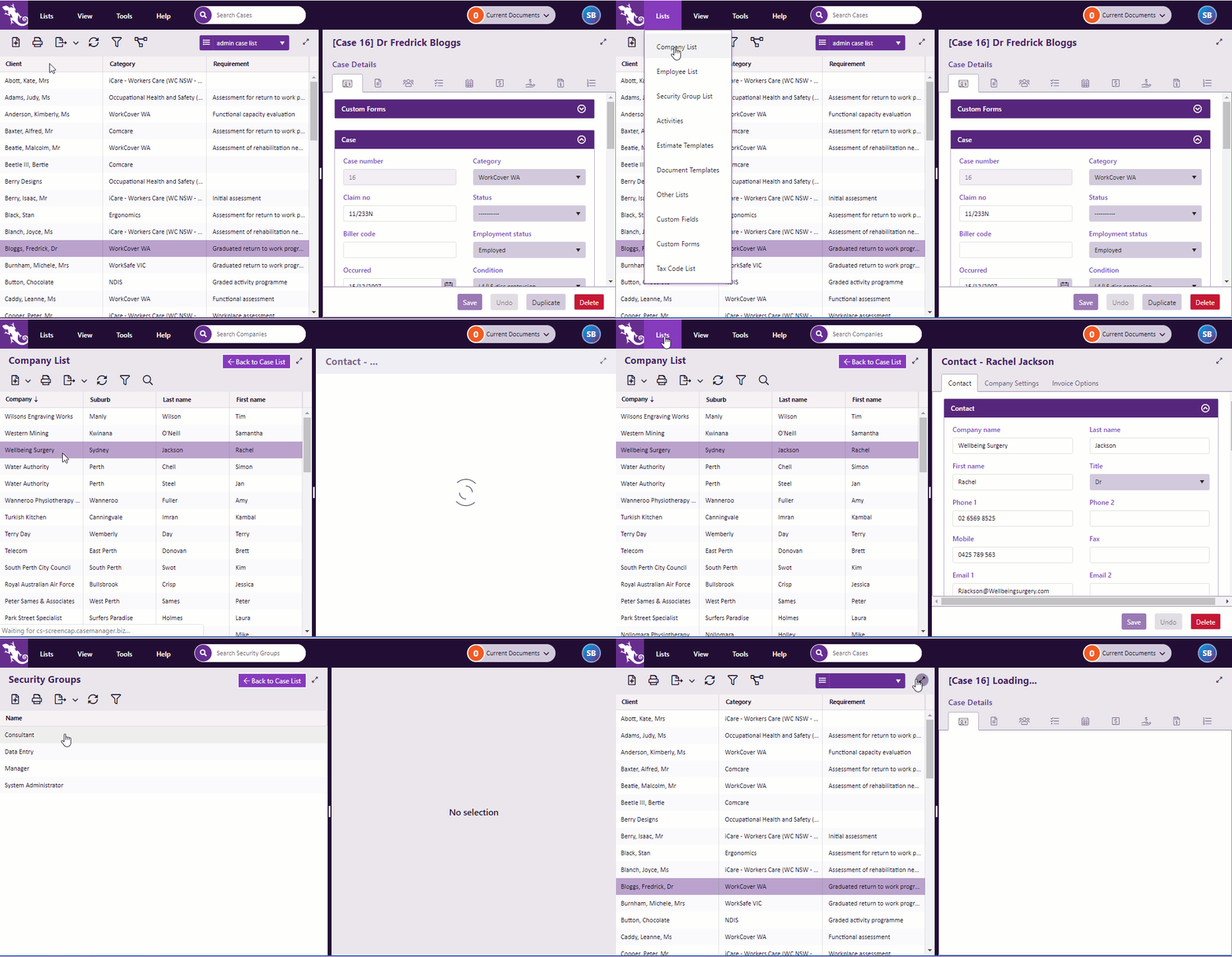
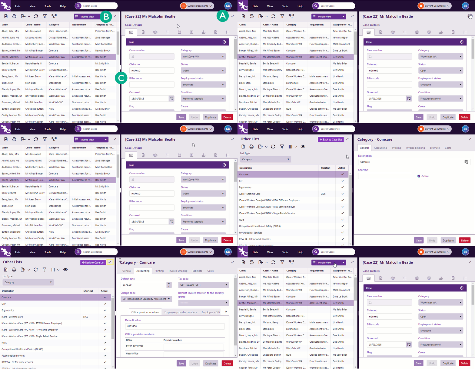
Lists, like the Company List, no longer appear in popup windows that obscure everything else. Instead they temporarily replace the Case List, without restricting access to the other tools and options. This makes navigation easier and performs much better on smaller screens. Click image to see this feature in action. Click again to close. Note that as before, you can open multiple browser tabs using the same login details. This means that you can work concurrently on cases and admin screens. |
|
Permissions |
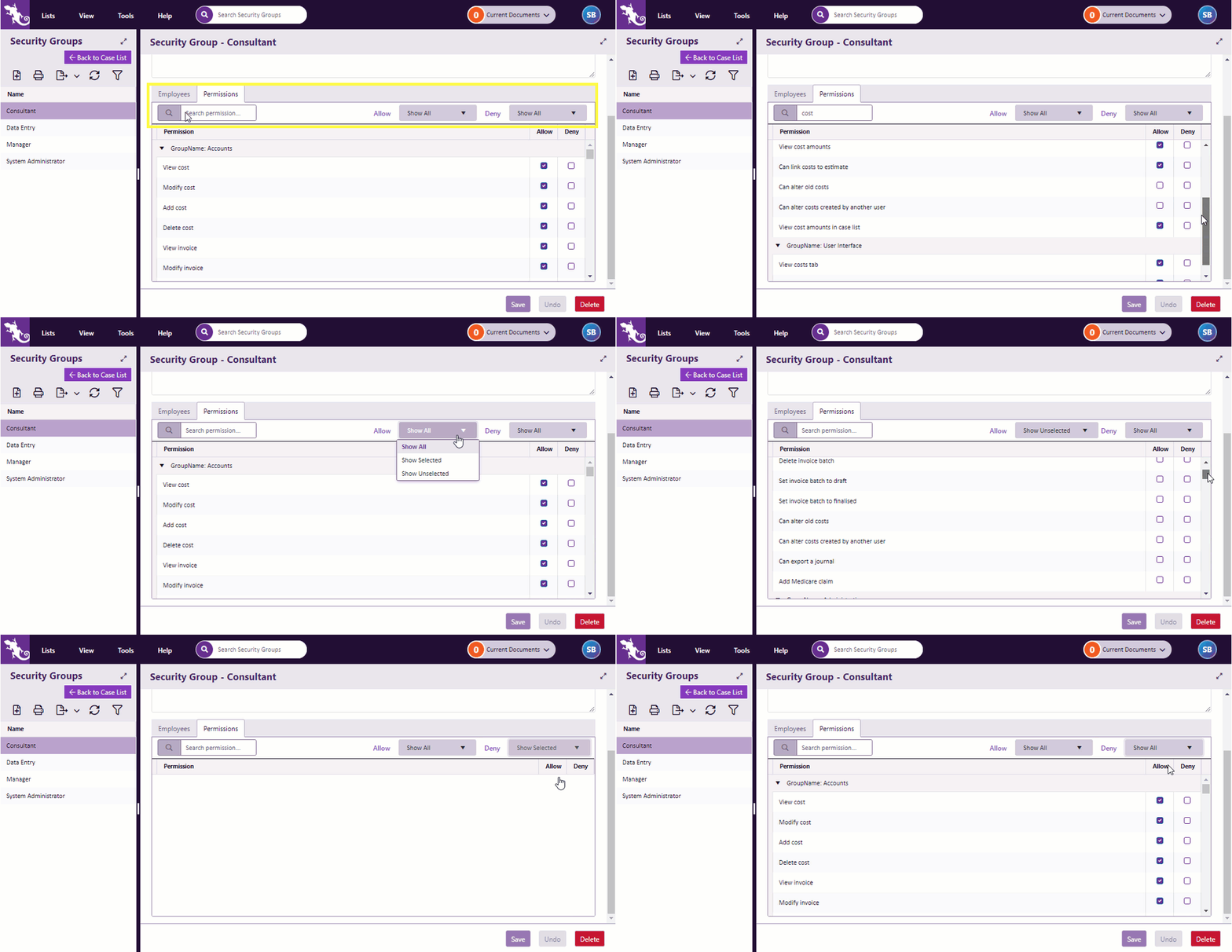
When managing user access to Case Manager's powerful functions it's useful to search and filter the permissions. And now you can. Click image to see this feature in action. Click again to close. |
Enhanced user experience
|
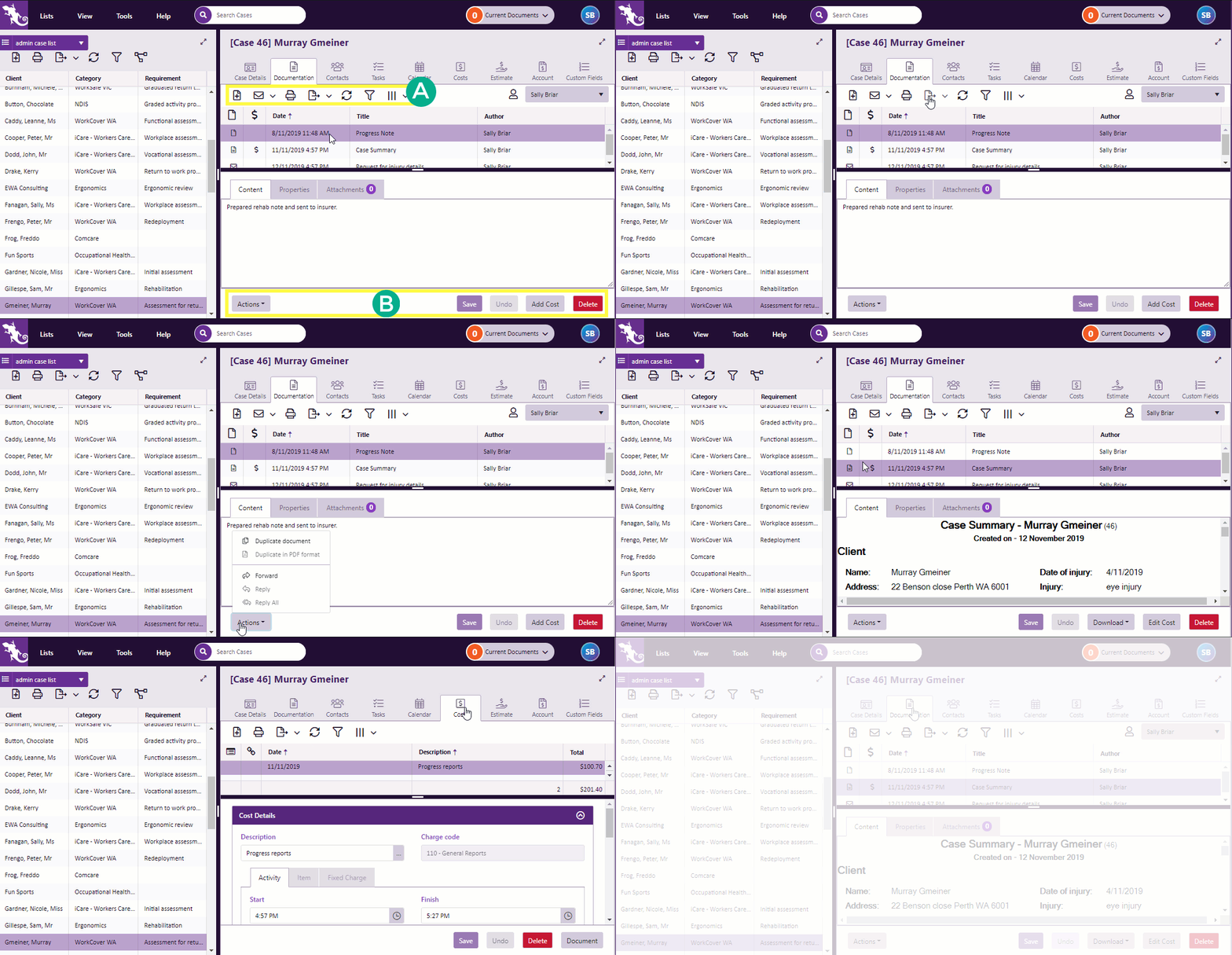
Buttons where they're needed |
The grid tools have been moved to more appropriate locations. They're separated into buttons for:
Click image to see this feature in action. Click again to close. For example, Undo, Save and Delete are at the bottom of the screen, next to the item that they affect. |
|
Buttons stay put |
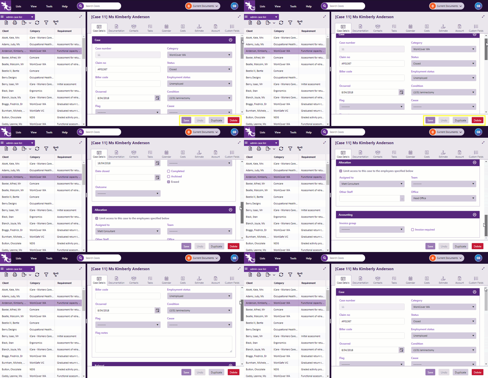
You no longer have to scroll to the bottom of the page to find buttons. They are fixed to the bottom of your screen. Click image to see this feature in action. Click again to close. |
|
Buttons enabled only when needed |
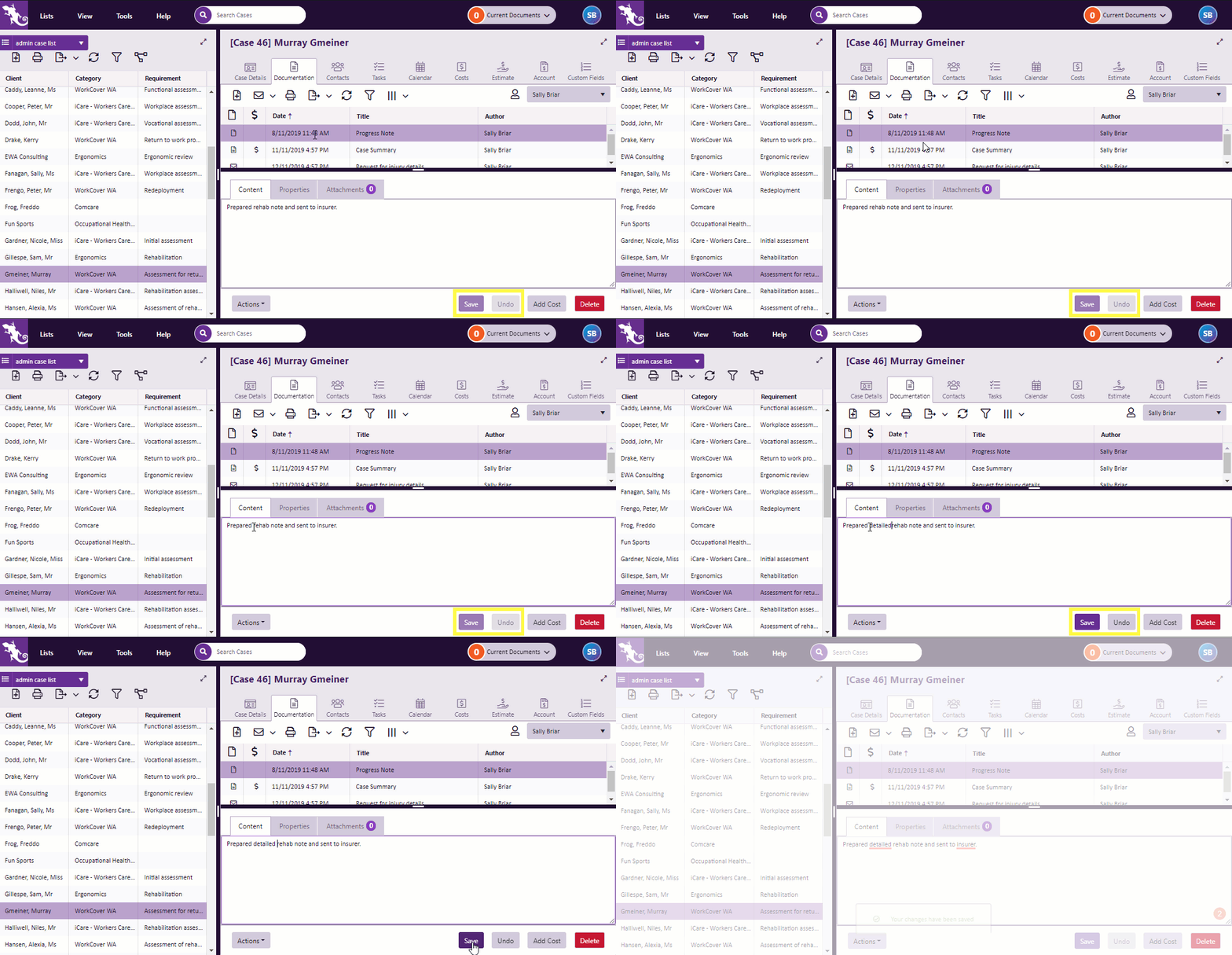
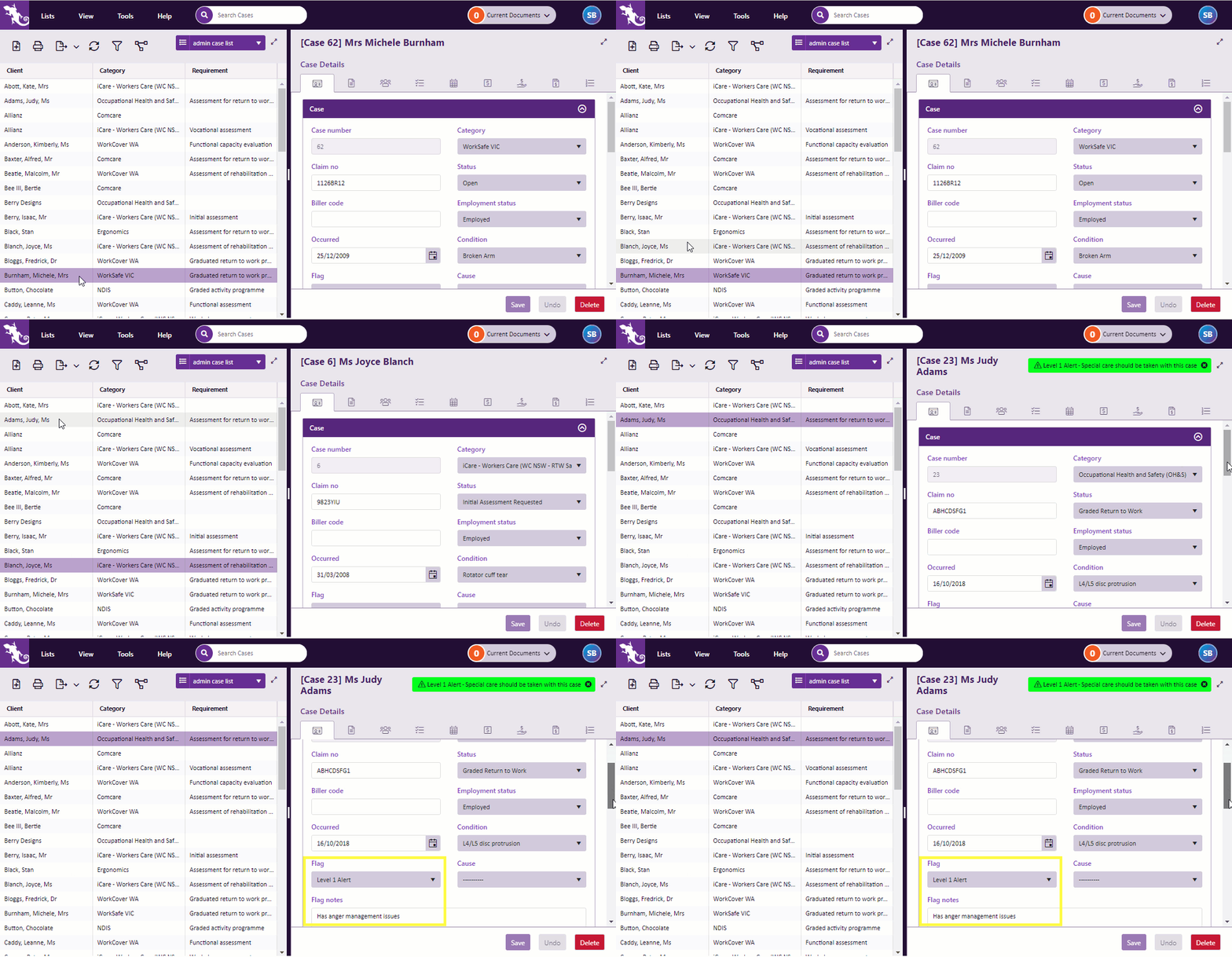
Buttons are only enabled when you need them. For example, below you will see that the Save and Undo buttons are disabled until changes are made to the document. In contrast, Add Cost and Delete are enabled and ready for use. Click image to see this feature in action. Click again to close. This feature enables you to glance at buttons and quickly see what is happening. |
|
Improved case flag experience |
On the old web version case flags could be hard to read. This has now been improved. Click image to see this feature in action. Click again to close. |
| Deep linking |
Want to share a particular screen with another Case Manager user? Just send them a link using the URL in the browser address bar. Once logged on, they can go straight to this piece of information simply by entering the URL in their own browser's address bar. |
Especially for smaller screens, such as iPad/Tablets
The tools described above make working on smaller screens much simpler. And because Case Manager for Web 6.0 is truly responsive, it adapts to whatever device it's running on. In addition you will notice:
|
Expand and collapse easily |
When you have a small amount of space you can quickly jump between the Case List and the selected case.
Click image to see this feature in action. Click again to close. As shown above, this feature is also available for all the lists. |
|
Splitter disappears |
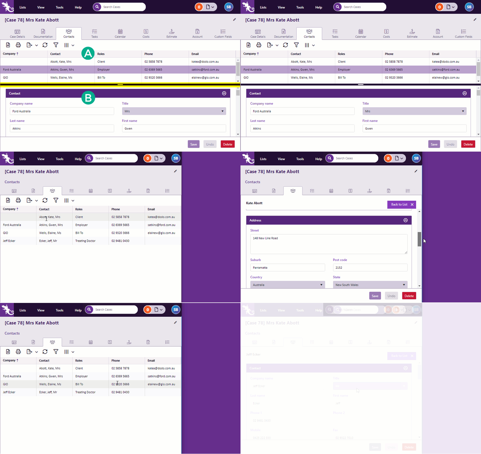
Usually a horizontal splitter bar separates:
On smaller screens the splitter bar disappears altogether, so that the list or the details of the selected item can use the full screen height. You can quickly switch between them. Click image to see this feature in action. Click again to close. |
|
Adaptive labels |
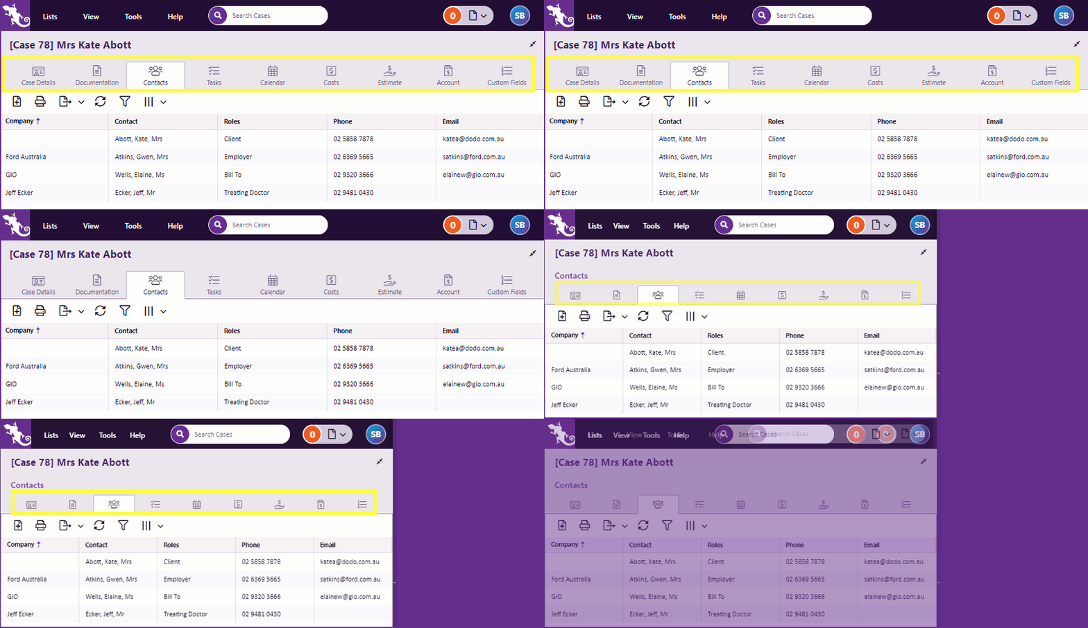
Labels adapt to the screen size. On a regular computer a case tab is labelled with text and an icon. On smaller screens, tab titles disappear, leaving only the icons: Click image to see this feature in action.. Click again to close. |
|
Use the whole screen |
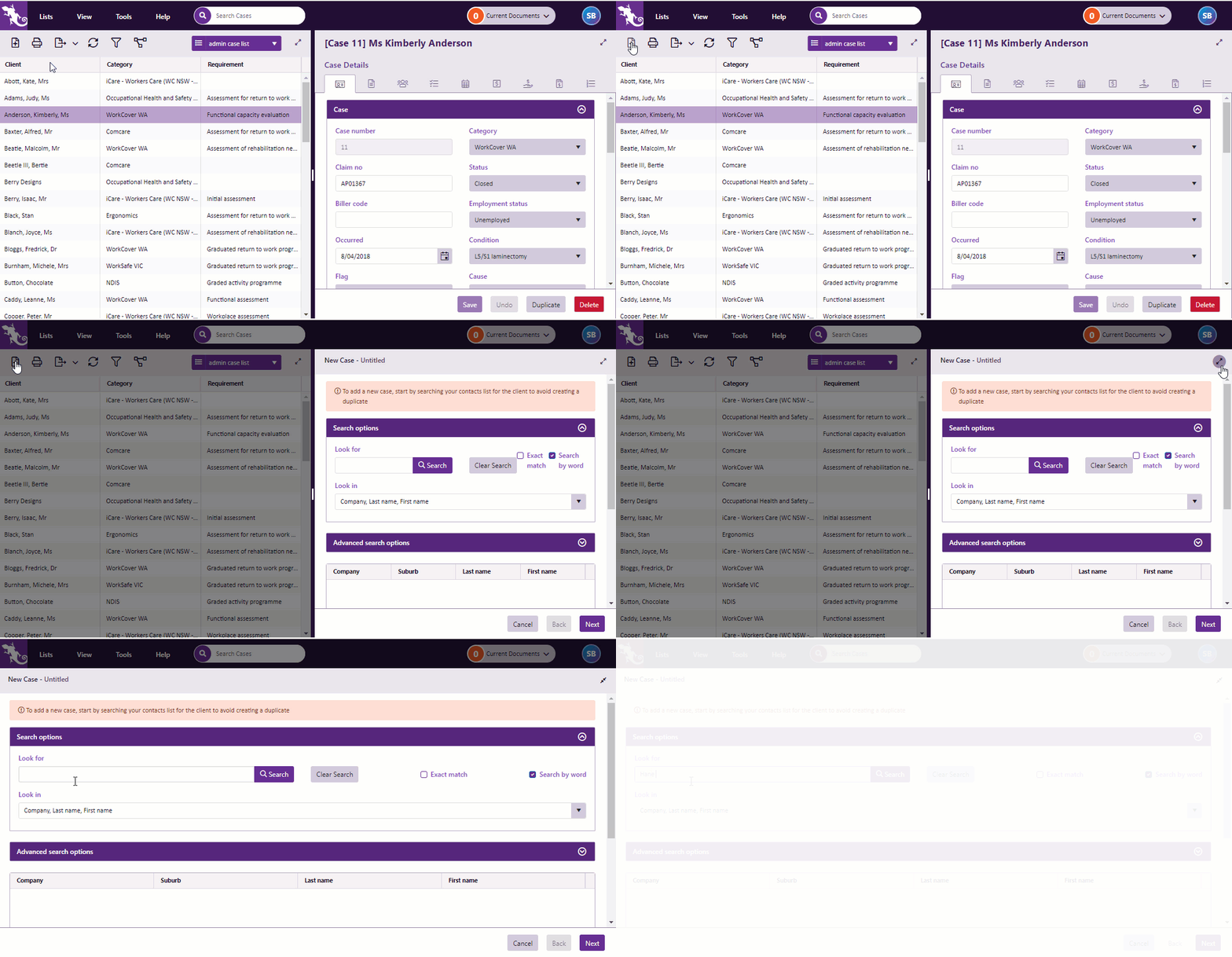
When you create a new item — a case, a cost, a document, etc — it no longer appears in a popup window that obscures everything else. It can also occupy the full screen, using the tools shown earlier. Click image to see this feature in action. Click again to close. |
Quickstart video for experienced web version users
We expect that you will be very happy with the faster speed and improved features of Case Manager for Web 6.0.
The short video orients you in this new environment.
Which browsers work best?
For Version 6.1 or earlier, the new web version is optimised for:
-
Google Chrome - this is the best browser to use
-
Mozilla Firefox
The following are not supported:
-
Microsoft Internet Explorer
-
Apple Safari
From Version 6.2 onwards, the web version has been optimised for:
-
Google Chrome
-
Microsoft Edge
The following are no longer supported:
-
Microsoft Internet Explorer
-
Mozilla Firefox
-
Apple Safari

